How to design a GREAT nonfiction book cover
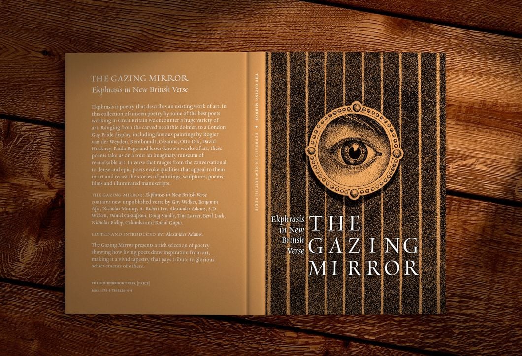
When authors hire me, book covers are one of the first things they ask about. For good reason.
Your book cover will get you sales.
As I’ve stated many times, I’m not an artist, so I make a point to work with cover artists who GET IT. They get visual design. They get what makes a reader click on a cover.
Recently I got an education on how the interior layout of your book can be just as important as the cover. You need both to be good.
But as I recently found out from artist Joseph Chapman, “Good” doesn’t mean “Pretty.”
I wanted to pick his brain on exactly what that meant, so he was kind enough to write the following guest post so we can all better understand how the visual elements of the book can get our stories in front of more readers.
Why Ugly is Better
As far as the look of your book, if you want it to be read and “digested,” instead of ignored (or worse, tossed in the TRASH), you must know the difference between Graphic Design and Book Formatting.
Graphic Design is commercial, and the style is as important as the content. It’s what sells your book.
Book Formatting, on the other hand, is subtle. It gently directs your readers’ attention only where it is needed, meaning it’s more effective the less it is detected. It’s what guides your reader from beginning to end as effortlessly as possible.
Graphic design prizes the bold, the disharmonious, and the irregular. Neutrality is death and the form must be conspicuous without being clownish. It is restrained only, if the designer has taste, from being arty and perfect.
But if you want to stand out in the commercial world of bookstores, webstores, social media ads and so on, consider what the Austrian satirist Karl Kraus, once said “In the world of the beautiful, the ugly thing stands out.”
Of course by ugly I don’t mean distasteful or poorly designed. For our purposes, ugly is a way of designing something that defies the conventions of whatever genre you’re writing in.
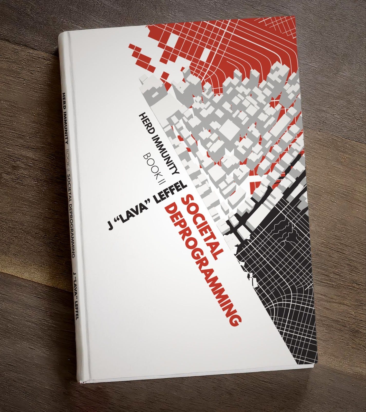
Too many cover designers use a standard template that all but guarantees your book will ‘disappear’ on the shelf.
The next time you’re in a bookstore, notice the book covers on display, and how there is a sickly sameness to them all. It’s almost depressing that none of the designers had the courage to be a little bit ‘ugly’ and grab your attention out of the swamp of the safe and sterile.
Furthermore, once you open one of these books, the pages themselves tend to be too ‘eye catching’ with all sorts of unnecessary and confusing formatting such as block quotes that intrude on the body text, weird font choices that seem picked at random out of a hat and so on.
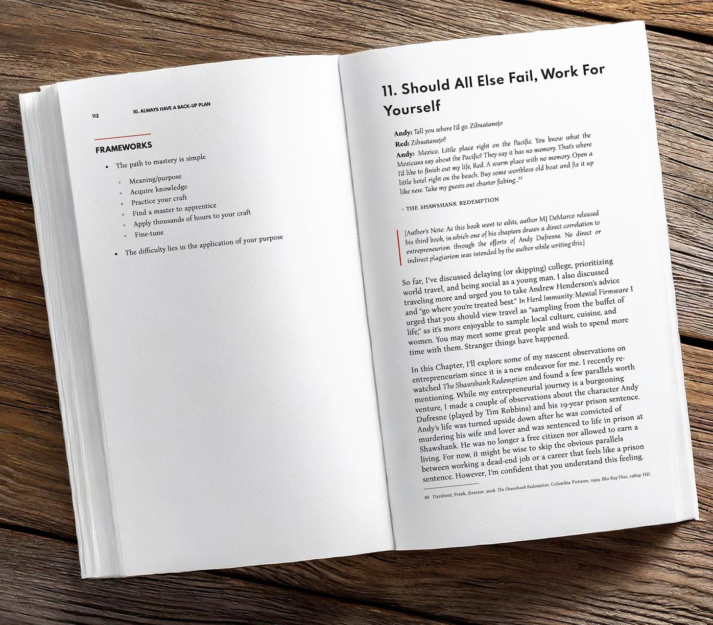
Some books even include quirky artificial markings and highlights to fool you into thinking you’re buying something ‘used and relatable,’ which only comes off as patronizing and scrapbookish.
In the modern publishing world, there is an unnecessary conflict between the selling power of your cover, and the readability of the interior pages.
The truth is you need both.
You need a catchy, interesting and yes, in my definition of the word, an ‘ugly’ book cover. And you also need a clean, well-structured page layout that readers don’t have to squint at or reread.
I’m not in the business of designing ‘perfect’ covers that your readers will fleetingly admire, then dismiss. Nor the business of formatting text in an instant gratification overwrought mess that will only trigger the indifferent reader’s desire to feel briefly stimulated.
And if you have a book you need formatted and designed for commercial profit that will also welcome quality readers as guests eager to read the entire book from cover to cover
It’s Kristin again…
If you want a real-life example of Joseph’s amazing work on both the cover AND the interior, check out Canine Conversations by Pete Campione, my most recent client who just released his fantastic nonfiction book:
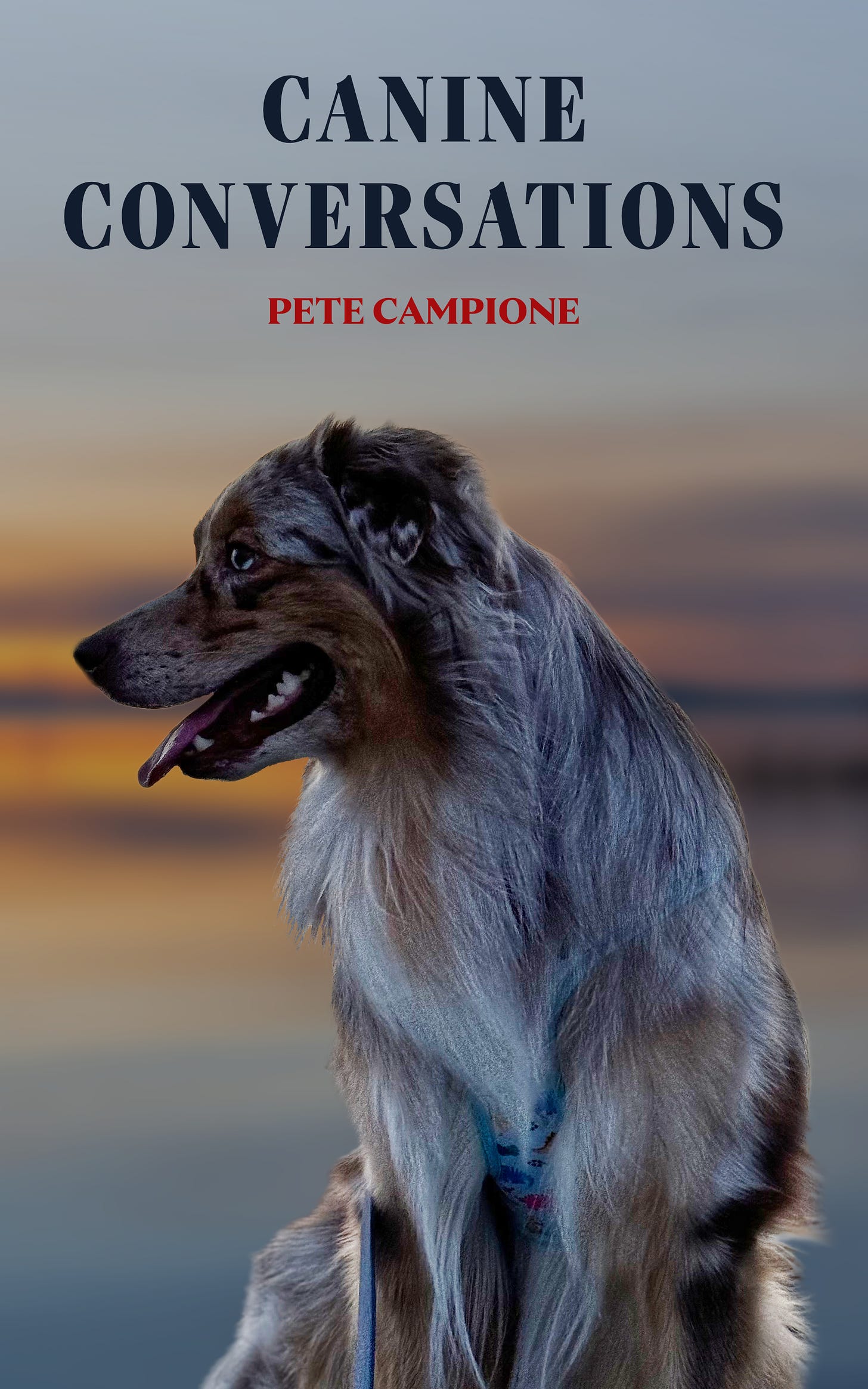
Pete has decades of dog training experience and I am so honored he let me take his knowledge and write this amazing book for him. I learned a lot about Gemma, my aging (and surly) German Shepherd. If you have a dog and want new insight into how to truly communicate with them, I recommend the book. And if you want to see how TALENTED Joseph is, pick up the paperback copy so you can get the full effect.
For fiction and short nonfiction, The Nonsense-Free Editing offers ebook and paperback formatting and self-publishing services.
